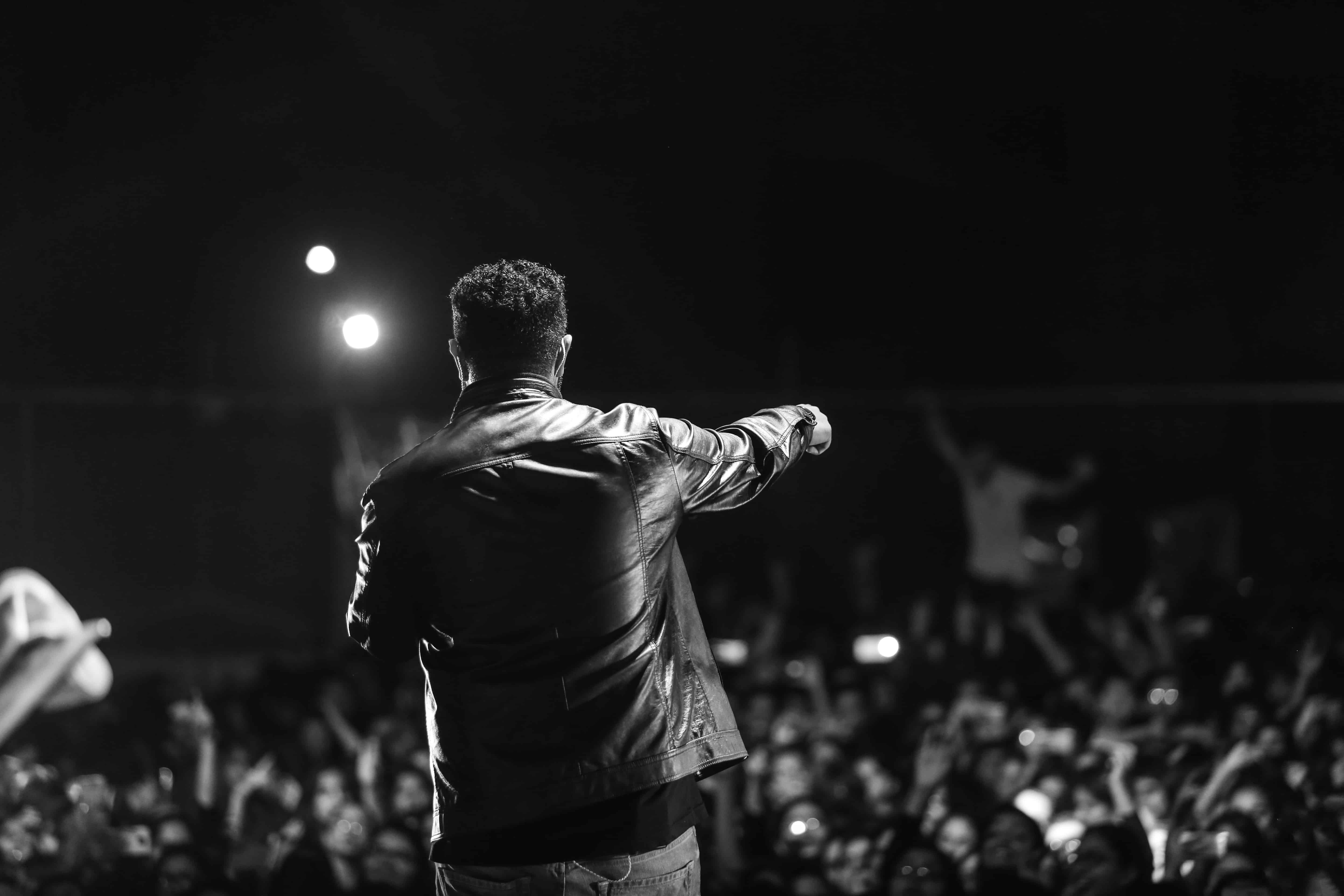
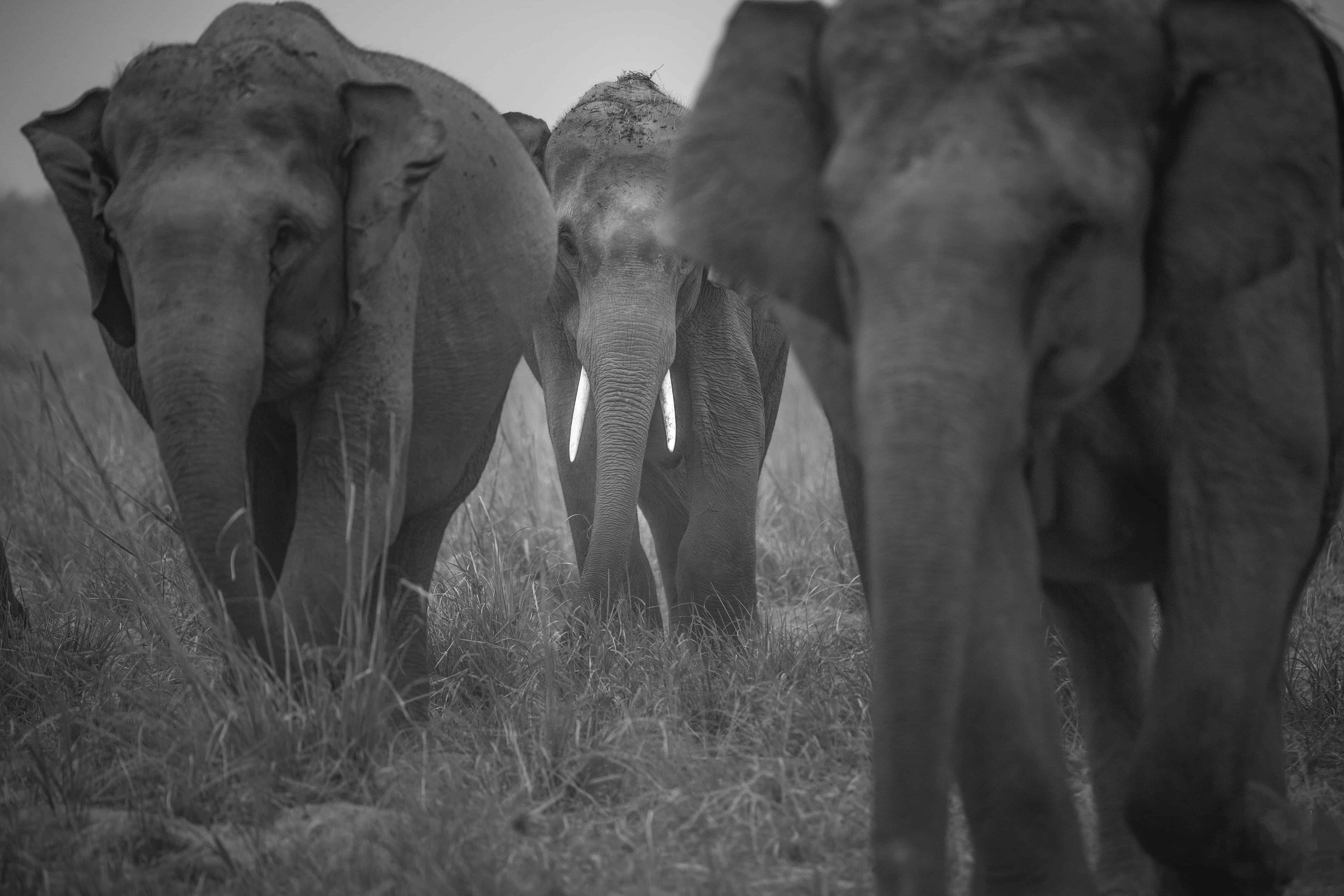
Why Monochrome Photography
The black and white give a timeless quality to the images. Hence, it’s one of the reasons why people are going for monochromatic photography more. This is all because of the thoughts behind the vision, a vision about portraying a colourful time as a different, colourless era. Also, people are into throwbacks more these days, and what else could justify the feels if not monochrome.
“To see in colour is a delight for the eye but to see in black and white is a delight for the soul.” -Andri Cauldwell
- Shoot RAW
The best way that photographers can capture high-quality images, whether colored or monochrome/black and white is to shoot RAW files. But if you shoot raw files simultaneously and set the camera to its monochrome Picture Style/Picture Control/Film Simulation mode, you get an indication of how the image will look in black and white. Having pictures clicked in raw gives you more pixels, added mouldability and ease when it’s finally time to edit and post-process your shots. Alternatively, you can shoot in both RAW + JPEG, if you also want to keep a JPEG version of each of your shots.
- Look for Contrast/Shape/Texture
The complimentary and adverse colours that bring a colour image to life are all reduced to black and white or shades of grey in a monochrome image and you have to look for tonal contrast to make a shot presentable, In colour photography eg: while capturing colored portraits, the eye gets immediately drawn to a red object on a green background. However, in monochrome photography, the brightness and contrast are same over these areas which results in a flat image that is dull straight from the camera. Thankfully, its is possible to adjust the brightness of blacks and whites separately to introduce some contrast. There are always exceptions, but as a general rule look for scenes that contain some strong blacks and whites.
This can be achieved by the light or by the brightness (or tone) of the objects in the scene as well as the exposure settings that you use. Setting the exposure for these brighter areas also makes the shadows darker, so the highlights stand out even more. Look for shapes, patterns, and textures in a scene and move around to find the best composition.

- Try Long Exposure
In monochrome photography, long exposure shots work effectively well, especially when there’s movement of water or clouds. To enhance tonal contrast, the highlights of the water during the exposure, for example, can be recorded across a wider area.
The hazy touch of the movement too adds textural contrast, if used with objects of solid property in the frame. If want, one can go with neutral density filter, for example, ‘Lee Filters’ Big stopper or Little Stopper to customize the exposure and extend shutter speed (by 10 and 4 stops respectively).
When exposures extend beyond for say, 1/60 sec, we need a tripod to keep the camera steady to avoid the haziness. It is suggestible to go for a remote realease or mirror lock-up to control the vibration and for aptly sharp images.
- Take Control
Also, colored filters can be used to change the contrast if shooting digital B&W images, it’s usual to restore until it’s processed. Adobe Camera Raw, which has more effective tools (in the HSL/ Grayscale tab) for you to adjust the brightness of eight different colors that form the image, Photoshop’s Channel Mixer was the preferred means
It’s easy to change one of these colors to make the image anything from white to black with the sliding control. Although, one should keep an eye on the whole image while adjusting a particular colour, since such gradations can make it look unnatural.
The adjustment of the brightness of a red or pink t-shirt with red sliding control might have an impact on the person’s skin, especially the lips.
Tonal range and contrast can be changed with the help of the Levels and Curves controls, but what helps you in creating separation between objects of the same brightness with different colors is HSL/Grayscale.
Feature Image Credits: Akarsh Mathur for DU Beat
Adithya Khanna
[email protected]


Comments are closed.